Let's build Windows 11 dropdown menu using Radix Primitives
Using Radix to build a fully-accessible dropdown menu

Hello there, and welcome back to the Let's Build something cool series. In this article, we'll build the Windows 11 dropdown that's displayed on the desktop. Here's a preview:
**Note:**The code sandbox is best viewed on a large screen
Prerequisite
Basic knowledge of React.js
Basic knowledge of the command line
Back story for the project
While watching the Next.js Conference, Pedro Duarte spoke on the topic: "So You Think You Can Build A Dropdown?" where he built an accessible dropdown making use of a library called Radix
What's Radix
Radix is an open-source UI component library for building high-quality, accessible design systems and web apps that are un-styled. Styles can be applied using any styling solution be it plain CSS, SCSS, Tailwind CSS and so on.
Some of the UI components they provide are: Accordion, Dialog, Dropdown Menu and lots more. Do check out their website to see more components: Radix
Setup
First thing first, we'll need a react project and do this, we need to install react with the command below:
npx create-react-app windows-dropdown
Now that we've got our react app setup, we'll need to install the primitive next, which in this case is the dropdown-menu. Run the command below to get it installed:
npm install @radix-ui/react-dropdown-menu
We'll need the icons Radix also provides, so let's install the icon library.
npm install @radix-ui/react-icons
**Note: ** Using the Radix icon library isn't mandatory, you could use SVG or images of your choice.
Building the dropdown component
Now, let's move to the src directory to create a components directory and then a file named WindowsDropdown.js (feel free to name the file name as you please).
In the WindowsDropdown.js file, let's get a functional component setup like this:
import React from "react";

function WindowsDropdown() {
   return (
      <div>
          Here's the windows dropdown component
      </div>
   )
}

export default WindowsDropdown;
Now, let's import the WindowsDropdown component in the App.js file, in order to view the WindowsDropdown component on the browser.
import WindowsDropdown from "./components/WindowsDropdown";

export default function App() {
  return (
    <div>
      <WindowsDropdown />
    </div>
  );
}
Run the command below to get the application running on the browser
npm start
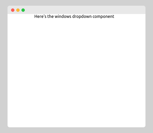
How to get the Dropdown setup
Before getting started with the windows dropdown component, let's demo how the Radix dropdown will be set up.
Note: You don't have to type in these code in your editor since it's just to explain how the library is used
import React from "react";
import * as DropdownMenu from "@radix-ui/react-dropdown-menu";

function WindowsDropdown() {
   return (
      <DropdownMenu.Root>
         <DropdownMenu.Trigger>Click me</DropdownMenu.Trigger>

         <DropdownMenu.Content>
             <DropdownMenu.Item>
                 New Tab
            </DropdownMenu.Item>
            <DropdownMenu.Item>
                 New Tab
            </DropdownMenu.Item>
         </DropdownMenu.Content>
     </DropdownMenu.Root>
   )
}

export default WindowsDropdown;
From the demo above, you'll notice the dropdown doesn't have styles applied. Try navigating through the items with the keyboard arrows (up key and down key) when the button is clicked; you'll notice the first item is focused, then when moved to the next item, it's also focused well; this will only work on a desktop, not mobile. This shows how accessible the library is.
- Firstly, we import all the various component parts that come with the dropdown primitive with the asterisk sign given an alias/label DropdownMenu
import * as DropdownMenu from "@radix-ui/react-dropdown-menu";
Note: Each component could be gotten individually like this:
import {Root} from "@radix-ui/..."
DropdownMenu.Root
Contains all the parts of the dropdown menu, basically housing all parts.DropdownMenu.Trigger
This is basically a button that toggles the dropdown menu when clicked.DropdownMenu.Content
This is the component that pops out when the dropdown menu is open.DropdownMenu.Item
This component contains the dropdown menu items.
Now let's go over a demo with a nested dropdown.
import React from "react";
import React from "react";
import * as DropdownMenu from "@radix-ui/react-dropdown-menu";

function WindowsDropdown() {
  return (
    <DropdownMenu.Root>
      <DropdownMenu.Trigger>Click me</DropdownMenu.Trigger>

      <DropdownMenu.Content>
        <DropdownMenu.Item>New Tab</DropdownMenu.Item>
        <DropdownMenu.Item>New Tab</DropdownMenu.Item>
        <DropdownMenu.Root>
          <DropdownMenu.TriggerItem>
            View more dropdown
          </DropdownMenu.TriggerItem>
          <DropdownMenu.Content>
            <DropdownMenu.Item>Auto arrange icons</DropdownMenu.Item>
            <DropdownMenu.Separator />
            <DropdownMenu.Item>Align icons to grid</DropdownMenu.Item>
          </DropdownMenu.Content>
        </DropdownMenu.Root>
      </DropdownMenu.Content>
    </DropdownMenu.Root>
  );
}

export default WindowsDropdown;
From the codesandbox above, you'll notice when the view more dropdown text is hovered on / navigated to through the arrow keys, another dropdown is shown. That's a nested dropdown, now, let's walk through how the code snipper is constructed.
DropdownMenu.TriggerItem
An item that opens a submenu. Used in combination with a nestedDropdownMenu. Must be rendered insideDropdownMenu.Root.
 (
    <DropdownMenu.Root>
      <DropdownMenu.Trigger>Click me</DropdownMenu.Trigger>

      <DropdownMenu.Content>
        <DropdownMenu.Item>...</DropdownMenu.Item>

        <DropdownMenu.Root>
          <DropdownMenu.TriggerItem>
            View more dropdown
          </DropdownMenu.TriggerItem>

          <DropdownMenu.Content>
            <DropdownMenu.Item>...</DropdownMenu.Item>

            <DropdownMenu.Item>...</DropdownMenu.Item>
          </DropdownMenu.Content>
        </DropdownMenu.Root>

      </DropdownMenu.Content>
    </DropdownMenu.Root>
  );
Styling the Dropdown
Styling the component is very easy, all we need is to apply classes className to each component we will like to style. Let's see this in action:
import React from "react";
import * as DropdownMenu from "@radix-ui/react-dropdown-menu";
import { ChevronRightIcon } from "@radix-ui/react-icons";

function WindowsDropdown() {
  return (
    <DropdownMenu.Root className="root">
      <DropdownMenu.Trigger className="trigger">Click me</DropdownMenu.Trigger>

      <DropdownMenu.Content className="content">
        <DropdownMenu.Item className="item">Tab One</DropdownMenu.Item>
        <DropdownMenu.Item className="item">Tab Two</DropdownMenu.Item>

        <DropdownMenu.Root>
          <DropdownMenu.TriggerItem className="item">
            View
            <div style={{ marginLeft: "auto" }}>
              <ChevronRightIcon />
            </div>
          </DropdownMenu.TriggerItem>
          <DropdownMenu.Content className="content content--drop">
            <DropdownMenu.Item className="item">
              Auto arrange icons
            </DropdownMenu.Item>
            <DropdownMenu.Separator />
            <DropdownMenu.Item className="item">
              Align icons to grid
            </DropdownMenu.Item>
          </DropdownMenu.Content>
        </DropdownMenu.Root>
      </DropdownMenu.Content>
    </DropdownMenu.Root>
  );
}

export default WindowsDropdown;
body {
  ...
}

.trigger {
  padding: 1rem 2rem;
  font-size: 20px;
  background: rgba(0, 0, 0, 0.61);
  color: #fff;
  border: 2px solid black;
  border-radius: 20px;
}

.content {
  background: #000000a2;
  padding-block: 10px;
  border-radius: 8px;
  box-shadow: 0 5px 6px 5px rgba(0, 0, 0, 0.199);
  color: rgb(224, 224, 224);
  min-width: 300px;
}

.content--drop {
  background: #000000ab;
  border: 1px solid black;
}

.content--drop .item {
  padding-left: 25px;
  justify-content: space-between;
}

.content > * + * {
  margin-top: 0.8rem;
}

.item {
  position: relative;
  display: flex;
  align-items: center;
  padding: 5px 10px;
  margin-inline: 10px;
  cursor: default;
  border-radius: 5px;
}

div [role="menuitem"],
div [role="menuitemradio"] {
  outline: none;
}

div [role="menuitem"]:focus,
div [role="menuitemradio"]:focus {
  background: #46464681;
}

@media (prefers-reduced-motion: no-preference) {
  .content {
    animation-duration: 400ms;
    animation-timing-function: cubic-bezier(0.16, 1, 0.3, 1);
    will-change: transform, opacity;
  }

  [data-state="open"][data-side="top"] {
    animation-name: slideDownAndFade;
  }

  [data-state="open"][data-side="right"] {
    animation-name: slideLeftAndFade;
  }
  [data-state="open"][data-side="bottom"] {
    animation-name: slideUpAndFade;
  }
  [data-state="open"][data-side="left"] {
    animation-name: slideRightAndFade;
  }
}

@keyframes slideUpAndFade {
  0% {
    opacity: 0;
    transform: translateY(9px);
  }
  100% {
    opacity: 1;
    transform: translateY(0);
  }
}

@keyframes slideRightAndFade {
  0% {
    opacity: 0;
    transform: translateX(-2px);
  }
  100% {
    opacity: 1;
    transform: translateX(0);
  }
}

@keyframes slideDownAndFade {
  0% {
    opacity: 0;
    transform: translateY(-2px);
  }
  100% {
    opacity: 1;
    transform: translateY(0);
  }
}

@keyframes slideLeftAndFade {
  0% {
    opacity: 0;
    transform: translateX(2px);
  }
  100% {
    opacity: 1;
    transform: translateX(0);
  }
}
Notice the use of the @keyframe rule from the snippet above. So it's possible to add animations also using Radix, which is super cool.
Also, from the CSS snippet, you'll notice the use of attribute selectors such as:
  [data-state="open"][data-side="top"] {
    animation-name: slideDownAndFade;
  }

  [data-state="open"][data-side="right"] {
    animation-name: slideLeftAndFade;
  }
  [data-state="open"][data-side="bottom"] {
    animation-name: slideUpAndFade;
  }
  [data-state="open"][data-side="left"] {
    animation-name: slideRightAndFade;
  }
The reason why there are various alternatives to the data-side attribute, which is added to the DropdownMenu.Component element is because depending on the space available for the dropdown, it'll adjust to the viewport to either show at the top, right, left, or bottom view, pretty much as you'll have it on Windows 11.
Eg:
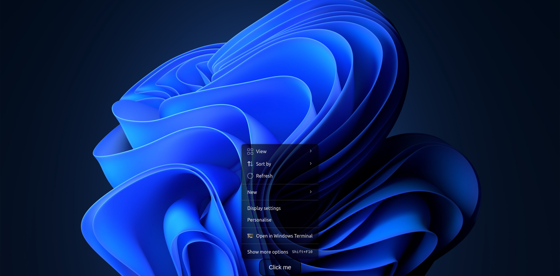
WindowsDropdown Conclusion
Here's the complete version for the windows dropdown below. Feel free to go through the code sandbox and if you have any questions concerning the project, feel free to ask. Thanks for reading, and see you in the next Let's Build something cool series
Resources
About the author
- I'm Favourite Jome, a Software Engineer focused on building reliable systems, great developer tooling, and seamless user experiences.
Comments
Join the discussionAwesome! This looks interesting. Will definitely check it out. Thanks for sharing
Great! do try it. There are more features that I didn't mention so if you try it you'll find them. Thanks for reading
This is awesome, thanks for sharing.
Thank you 😊
Nice, thanks for sharing, Favourite Jome
Thanks for reading 😊
Wow! Nice work, Jome. It looks so cool. 🤩 Will definitely check out this library when I get into React.
Thanks Eke, its a cool library
Let's Build Something Cool
In this series, we'll build something cool together, learning new things and playing around.


