My Experiences at Side Hustle Internship
What I've done so far at Sidehustle Internship.

Hello! 👋, In this article, I'll be sharing my experiences from Week 1 to Week 2 of the Side Hustle Internship, what I've learnt, the tasks given and so on.
But before I share how my experiences have been so far at Internship, I'll like to tell you what Side Hustle is all about.
Side Hustle is a talent management platform that is aimed at reducing the rate of youth unemployment and poverty in Nigeria, by empowering youths (undergraduates, graduates and youth corp members) to learn from the best minds, execute their ideas and earn a living by offering their services to businesses.
Note: Side Hustle Internship is done fully online.
Founder of Sidehustle: Damilola Oyediran
My Experiences at the Internship
Honestly, it's been a refreshing experience for me. I've been able to go through things I already knew, things I had forgotten and learnt new things also.
The Internship has made me realise that just learning new technologies/tools is not enough, I should also be thinking about the monetary aspect of things too.
Because the end goal is to turn my learnings and passion into a way for me to meet my daily needs at the end by making money.
Also, I've been able to network with some fellow minded people, helping others with the little way I could and also reviewing others work.
Week 1
Here are the topics covered in Week 1.
- HTML
- Git and Github
and lots more...
Week 1 Task
The task was to create a tribute page, about anyone using up to 20 HTML tags.
Here's my solution to the task: task 1 solution
Week 2
The mentors went over CSS, how a website should be hosted, what and how things should be implemented, etc.
Here are the topics covered in Week 2.
- Introduction to CSS
- How CSS works behind the scene (Cascade & Specificity)
- Responsive Design Strategies
- Selecting breakpoints for media-queries
- What is hosting/deployment
- The different ways of hosting a website
- Blogging
- The importance of blogging and content writing
Week 2 Task
Week 2 task is a challenge from Frontendmentor. Here's the challenge - Fylo dark theme landing page.
Actually, I had done this challenge already before but using Tailwindcss, but the task instruction was that no framework should be used but just plain CSS, so I had no other choice than to do it again.
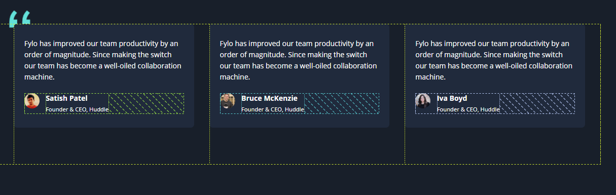
Also, the main object for the task is to make use of CSS flex and CSS grid which was taught during Week 2.
CSS Grid
For practising CSS grid, these are the sections I implemented Grid.
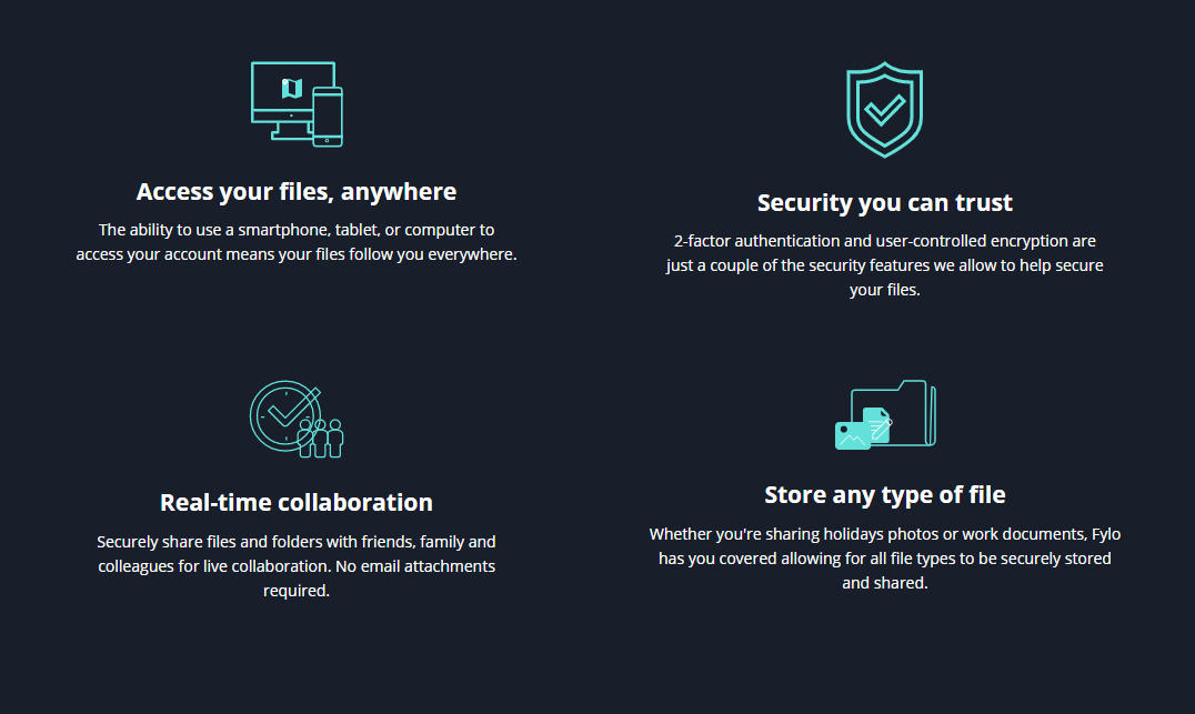
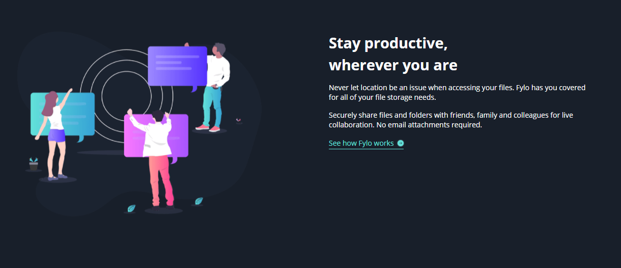
CSS Flexbox
As for CSS flexbox, here are the sections I implemented the Flex functionality.
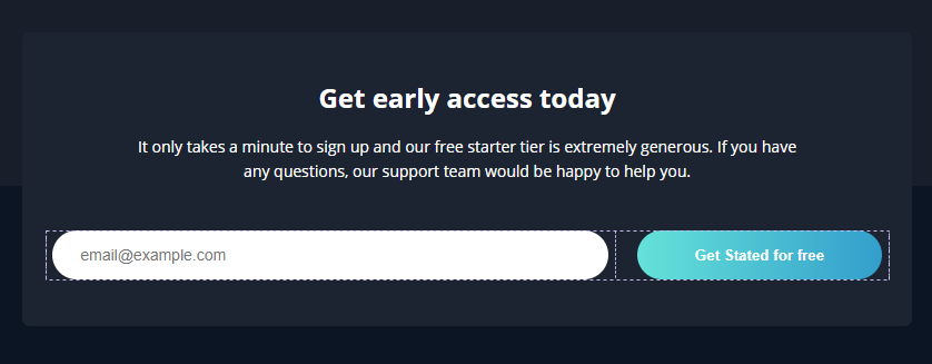


Challenge faced
While working on the task, I came across a challenge, a section of the design took me a while to wrap my head around it, but eventually, I was able to make it work.
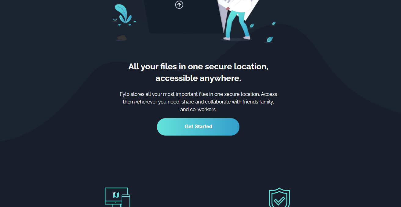
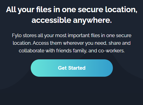
Looking at the images below, you'll notice a curved background beneath the hero content, the wave like curved background is an SVG file, one for a desktop view and the other for a mobile view. So the problem was to display the appropriate curved background to the appropriate screen view without the background being off at a point.
Desktop view
Mobile view
Remember I said earlier I had already done the challenge from Frontendmentor using Tailwindcss. While doing it then, I didn't have a hard switching between the two backgrounds at different screen views due to Tailwindcss utility classes.
So how did I overcome this challenge without Tailwindcss?
In other, for me to overcome the challenge, I made use of the picture element.
<picture>
  <source media="(min-width: 376px)" srcset="./images/bg-curvy-desktop.svg" />
  <img src="./images/bg-curvy-mobile.svg" alt="a navy blue background image" />
</picture>
From the snippet above, inside of the picture element, you'll notice the use of the source element and also the img element.
So the picture element holds source element and the img element, though you could have multiple source elements for different screen views.
The source element has the following attributes:
- srcset (required) - defines the URL of the image to show
- media - accepts any valid media query that would normally be defined in a CSS
- sizes - defines a single width descriptor, a single media query with width descriptor, or a comma-delimited list of media queries with a width descriptor
- type - defines the MIME-type
The above information about the
sourcewas gotten from w3schools, if you'll like to know more about the element do click on the link above.
The img element is required as the last child tag of the picture declaration block.
The img element is used to provide backward compatibility for browsers that do not support the picture element, or if none of the source tags matched.
So that's how I overcame that challenge also with the use of some CSS tricks, which is available in the project submission on Github. Click here to view the project code.
Live Demo to the Task: jome-sidehustle-task2.netlify.app/
Github Link: Sidehustle-task_fylo-dark-theme-landing-page
Conclusion
It's been a fun and exciting program, meeting new people and also networking with others. I'm looking forward to the rest of the week and other tasks.
Thanks for reading, see you next time 😉
About the author
- I'm Favourite Jome, a Software Engineer focused on building reliable systems, great developer tooling, and seamless user experiences.
Comments
Join the discussionAmazing
Thanks!
This is awesome 👌
Thanks, Ndupu!


