Let's build a Calculator App (React Native)

Welcome back to the Let's build Something Cool series, where we build cool things, at least from my perspective 😊, but really it's a series where we go in-depth about the cool things I build, but then we get to build it together.
In this article, we'll build a Calculator application similar to Samsung's calculator app, and use Expo, a framework that allows us to get started with React Native applications quickly.
There are a bunch of requirements we'll need before building in the Calculator application, but if you'll like to skip the requirements section cause you're familiar with React Native and Expo, click here to do so.
Prerequisite
Basic knowledge of React
Basic knowledge of React Native
Requirements
Install Node
Node is pretty much essential, so visit Nodejs.org and download the Long Term Support (LTS) version of Nodejs.
Once you're done downloading and installing Node.js, run the command below to know if it's up and running on your machine.
node -v
Install Expo
There are two tools we'll need to set up Expo, first is the Expo CLI which serves the project, and second is the client app called Expo GO which allows us to view the project on either an Andriod or IOS device.
Install Expo CLI
npm install -g expo-cli
Install Expo Go
Further guides for the Expo installation can be found here.
Getting Started
Firstly we'll need to install the necessary dependencies to get building, and the first would be Expo.
npx create-expo-app calculator-app && cd calculator-app
Once the installation process is completed and we've changed our directory to calculator-app, let's start our app, making sure it works.
Run the Project
npm start
yarn start would also work if you have yarn installed.
On the terminal, you'll see a QR code, which we'll need to scan with the Expo Go app, which I guess you've downloaded from Play Store already.
But if you've not got the Expo app yet, download it here for Android and here for iOS to follow along with the article.
To work with the Expo Go app and our project on our computers, we would need to be connected to the same network; this is very important.
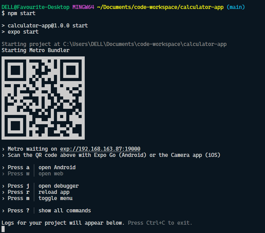
The terminal interface should look like this when the start command is run:

Now, we need to open the Expo Go app on our mobile devices, scan the QR code, and we should see this interface on our phones.

Folder Structure
Let's go over what the folder structure entails:

Note: As of the Expo version
47.0.12, this is how the folder structure is
/.expo - this folder got created when we started the application and contains devices.json and README.md files. Please go through the README file to know what this folder is about, but really we can ignore it.
/assets - this is where we store any assets we may want to use in our application, like images, videos, fonts and icons
/node_modules - these are all the packages we have installed that allow Expo and React Native to run. Further packages installed with
npm installget added here..gitignore - this is a file to tell .git which files and directories we want to omit from source control (Git). node_modules and .expo directories are omitted by default.
App.js - the main entry point to our application. This is where you'll start adding code!
app.json - another config file that contains expo metadata
babel.config.js - babel config, used to add the expo preset
package.json - this is where you list dependencies and add scripts
package-lock.json - this file shows the map of all the dependencies installed
Breakdown of the Calculator Layout
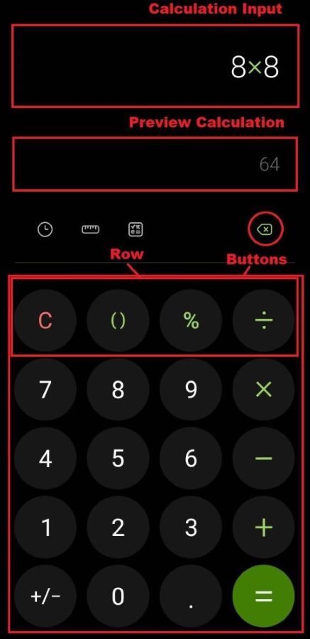
The calculator app UI can be broken down into four main components we'll need to build; first, an input box where the calculations would be done, referred to as the Calculation Input from the image below.
Then we have the Preview Calculation component, which shows a preview of the answer when a valid operation occurs; next, we have Rows of Buttons.

I'm sorry for the poor image quality, I'll look for better ways to edit images next time 😅
Coding Time
Let's open the App.js file, we should have the snippet of code below or similar in the file:
import { StatusBar } from 'expo-status-bar';
import { StyleSheet, Text, View } from 'react-native';

export default function App() {
  return (
    <View style={styles.container}>
      <Text>Open up App.js to start working on your app!</Text>
      <StatusBar style="auto" />
    </View>
  );
}

const styles = StyleSheet.create({
  container: {
    flex: 1,
    backgroundColor: '#fff',
    alignItems: 'center',
    justifyContent: 'center',
  },
});
We'll need to create the Calculation Input first, so remove the <Text> component and replace it with an <TextInput /> component.
import { StatusBar } from 'expo-status-bar';
import { StyleSheet, Text, View } from 'react-native';

export default function App() {
  return (
    <View style={styles.container}>
      <TextInput value="Here's were we type our calculation!" />
      <StatusBar style="auto" />
    </View>
  );
}

const styles = StyleSheet.create({
  container: {
    flex: 1,
    backgroundColor: '#fff',
    alignItems: 'center',
    justifyContent: 'center',
  },
});
Here's what we should have on the Expo Go app on our devices.

Notice the input is at the centre of the screen; let's fix that and add some colours.
import { StatusBar } from "expo-status-bar";
import { StyleSheet, Text, TextInput, View } from "react-native";

export default function App() {
  return (
    <View style={styles.container}>
      <TextInput
        style={styles.input}
        value="Here's were we type our calculation!"
      />
      <StatusBar style='auto' />
    </View>
  );
}

const styles = StyleSheet.create({
  container: {
    flex: 1,
    backgroundColor: "#010101",
    paddingVertical: 30,
    paddingHorizontal: 20,
  },
  input: {
    marginTop: 40,
    borderWidth: 1,
    padding: 10,
    color: "#fff",
    fontSize: 36,
  },
});
Now the UI should look like this, which is much better.

Let's add state to the <TextInput /> to keep track of the calculating number and operators entered.
...
export default function App() {
  const [calValue, setCalValue] = useState("");
  return (
    <View style={styles.container}>
      <TextInput
        style={styles.input}
        value={calValue}
        onChangeText={setCalValue}
        cursorColor='#8ad8d1'
        autoFocus={true}
        textAlign='right'
        showSoftInputOnFocus={false}
      />
      <StatusBar style='auto' />
    </View>
  );
}
...
The Calculation Input is all set, but notice the showSoftInputOnFocus={false} prop on the <TextInput /> component. The prop is added to make sure the phone keyboard doesn't show when the input is on focus cause we don't need the phone's keyboard; we'll create ours.
Let's move to the Preview Calculation Input, which follows the same pattern we did for the calculation input.
import { StatusBar } from "expo-status-bar";
import { useState } from "react";
import { StyleSheet, Text, TextInput, View } from "react-native";

export default function App() {
  const [calValue, setCalValue] = useState("");
  const [previewValue, setPreviewValue] = useState("");

  return (
    <View style={styles.container}>
      <TextInput
        style={styles.input}
        value={calValue}
        onChangeText={setCalValue}
        cursorColor='#8ad8d1'
        autoFocus={true}
        textAlign='right'
        showSoftInputOnFocus={false}
      />
      <TextInput
        value={previewValue}
        onChangeText={setPreviewValue}
        cursorColor='#8ad8d1'
        textAlign='right'
        caretHidden={true}
        style={[styles.input, styles.prevInput]}
        showSoftInputOnFocus={false}
      />
      <StatusBar style='auto' />
    </View>
  );
}

const styles = StyleSheet.create({
  container: {
    flex: 1,
    backgroundColor: "#010101",
    paddingVertical: 30,
    paddingHorizontal: 20,
  },
  input: {
    marginTop: 40,
    borderWidth: 1,
    padding: 10,
    color: "#fff",
    fontSize: 36,
  },
  prevInput: {
    fontSize: 24,
    marginTop: 40,
    marginBottom: 30,
    color: "#616161",
  },
});
Next, let's move the backspace button; for this, we'll need to install a package @expo/vector-icons which comes with the icon we need. Run the command below:
npm install @expo/vector-icons
Once it's installed, we'll need to add the backspace icon to the code and its functionality.
...
import { Pressable, StyleSheet, Text, TextInput, View } from "react-native";

export default function App() {
  const [calValue, setCalValue] = useState("");
  const [previewValue, setPreviewValue] = useState("");

  const handleBackSpace = () => {
    const remainValue = calValue.slice(0, calValue.length - 1);
    setCalValue(() => remainValue);
  };

  return (
    <View style={styles.container}>
      <TextInput
        style={styles.input} ...
      />
      <TextInput
        value={previewValue} ...
      />

      <View style={styles.backButton}>
        <Pressable
          onPress={() => handleBackSpace()}
          disabled={calValue ? false : true}
        >
          <Ionicons
            name='md-backspace-outline'
            size={24}
            color={calValue ? "green" : "#035903"}
          />
        </Pressable>
      </View>

      <View
        style={{
          height: 1,
          backgroundColor: "#575757",
          marginVertical: 20,
        }}
      />
      <StatusBar style='auto' />
    </View>
  );
}

const styles = StyleSheet.create({
  container: {...},
  input: {...},
  prevInput: {...},
  backButton: {
    flexDirection: "row",
    justifyContent: "flex-end",
  },
});
Notice from the snippet above the Pressable component is used to indicate the icon would be clicked and has two props, onPress which listens to the pressing of the icon, which then calls the handleBackSpace function, and the second prop is disabled , which makes the icons not pressable when there's no value in the Calculation input.
The handleBackSpace() function removes the last value in the calValue state and then update the calValue state.
The self-closing View component is to indicate a line in the UI. Now the UI should look like this:

From the UI, we know we need a row of buttons, so let's create a component named Row but still, in this App.js file cause, it isn't a complicated component.
...
export default function App() {
...
}

function Row({ children }) {
  return <View style={styles.row}>{children}</View>;
}

const styles = StyleSheet.create({
  ...
  row: {
    flex: 1,
    flexDirection: "row",
    justifyContent: "space-between",
  },
});
That's all for the Row component; it basically composes several button components, which we'll be working on next.
Let's create a new component named Button.js in a components directory from the root directory, that is:
|-components
| -- Button.js
App.js
// Button.js

import { TouchableHighlight, Text, StyleSheet } from "react-native";
import React from "react";

export default function Button({ label, type, handlePress, icon }) {
  const getTextColor =
    type === "operator" ? "green" : type === "clear" ? "red" : "#fff";

  const getButtonColor =
    type === "equal"
      ? { backgroundColor: "green" }
      : { backgroundColor: "#171717" };

  return (
    <TouchableHighlight
      underlayColor={type === "equal" ? "#04ac04" : "#444444"}
      style={[styles.button, getButtonColor]}
      onPress={() => handlePress(label)}
    >
      {icon ? (
        icon
      ) : (
        <Text style={{ fontSize: 26, color: getTextColor, fontWeight: "bold" }}>
          {label}
        </Text>
      )}
    </TouchableHighlight>
  );
}

const styles = StyleSheet.create({
  button: {
    borderRadius: 50,
    backgroundColor: "#171717",
    width: 80,
    height: 80,
    alignItems: "center",
    justifyContent: "center",
  },
});
From the code above, we can see there's a lot going on. The Button component accepts four pros { label, type, handlePress, icon } where
Labelis the text or number that the button should displaytypeprop is to identify what the button does; is it going to be for an operator or clear (which removes the numbers and operator for the Calculation Input) or number.handlePressprop is a function that takes in thelabelas an argument and does the necessary operation with it, which we'll get into later on.iconprop is an icon component that will be displayed in the button instead of thelabelif available.
Now, let's add the button components to the `App.js` file and their various functionalities.
import { StatusBar } from "expo-status-bar";
import { useState } from "react";
import { Pressable, StyleSheet, Text, TextInput, View } from "react-native";
import { Ionicons, FontAwesome5, FontAwesome } from "@expo/vector-icons";
import { MaterialCommunityIcons } from "@expo/vector-icons";
import Button from "./components/Button";

export default function App() {
  const [calValue, setCalValue] = useState("");
  const [previewValue, setPreviewValue] = useState("");
  const [isAnswer, setIsAnswer] = useState(false);

  const ansColor = {
    color: isAnswer ? "green" : "white",
  };

  const handleBackSpace = () => {
    const remainValue = calValue.slice(0, calValue.length - 1);
    setCalValue(() => remainValue);
  };

  const handlePress = (text) => {
    setIsAnswer(false);
    const corrText = text === "X" ? "*" : text === "+/-" ? "-" : text;
    setCalValue((prev) => prev + `${corrText}`);
  };

  const handleClear = () => {
    setCalValue("");
  };

  const handleEqual = () => {
    if (!previewValue) return;
    setCalValue(previewValue);
    setPreviewValue("");
    setIsAnswer(true);
  };

  return (
    <View style={styles.container}>
      <TextInput
        style={[styles.input, ansColor]}
        value={calValue}
        onChangeText={setCalValue}
        cursorColor='#8ad8d1'
        autoFocus={true}
        textAlign='right'
        showSoftInputOnFocus={false}
      />
      <TextInput
        value={previewValue}
        onChangeText={setPreviewValue}
        cursorColor='#8ad8d1'
        textAlign='right'
        caretHidden={true}
        showSoftInputOnFocus={false}
        style={[styles.input, styles.prevInput]}
      />

      <View style={styles.backButton}>
        <Pressable
          onPress={() => handleBackSpace()}
          disabled={calValue ? false : true}
        >
          <Ionicons
            name='md-backspace-outline'
            size={24}
            color={calValue ? "green" : "#035903"}
          />
        </Pressable>
      </View>

      <View
        style={{
          height: 2,
          backgroundColor: "#575757",
          marginVertical: 20,
        }}
      />

      <View style={styles.buttonContainer}>
        <Row>
          <Button handlePress={handleClear} label={"C"} type='clear' />
          <Button
            handlePress={handlePress}
            label={"()"}
            type='operator'
            icon={
              <MaterialCommunityIcons
                name='code-parentheses'
                size={30}
                color='green'
                style={{ fontWeight: "bold" }}
              />
            }
          />
          <Button handlePress={handlePress} label={"%"} type='operator' />
          <Button
            handlePress={handlePress}
            label={"/"}
            type='operator'
            icon={<FontAwesome5 name='divide' size={24} color='green' />}
          />
        </Row>
        <Row>
          <Button handlePress={handlePress} label={"7"} />
          <Button handlePress={handlePress} label={"8"} />
          <Button handlePress={handlePress} label={"9"} />
          <Button
            handlePress={handlePress}
            label={"X"}
            type='operator'
            icon={<FontAwesome5 name='times' size={24} color='green' />}
          />
        </Row>
        <Row>
          <Button handlePress={handlePress} label={"4"} />
          <Button handlePress={handlePress} label={"5"} />
          <Button handlePress={handlePress} label={"6"} />
          <Button
            handlePress={handlePress}
            label={"-"}
            type='operator'
            icon={<FontAwesome name='minus' size={24} color='green' />}
          />
        </Row>
        <Row>
          <Button handlePress={handlePress} label={"1"} />
          <Button handlePress={handlePress} label={"2"} />
          <Button handlePress={handlePress} label={"3"} />
          <Button
            handlePress={handlePress}
            label={"+"}
            type='operator'
            icon={<FontAwesome5 name='plus' size={24} color='green' />}
          />
        </Row>
        <Row>
          <Button handlePress={handlePress} label={"+/-"} />
          <Button handlePress={handlePress} label={"0"} />
          <Button handlePress={handlePress} label={"."} />
          <Button
            handlePress={handleEqual}
            label={"="}
            type='equal'
            icon={<FontAwesome5 name='equals' size={24} color='white' />}
          />
        </Row>
      </View>

      <StatusBar style='auto' />
    </View>
  );
}

function Row({ children }) {
  return <View style={styles.row}>{children}</View>;
}

const styles = StyleSheet.create({
  container: {
    flex: 1,
    backgroundColor: "#010101",
    paddingVertical: 30,
    paddingHorizontal: 20,
  },
  input: {
    marginTop: 40,
    borderWidth: 1,
    padding: 10,
    color: "#fff",
    fontSize: 36,
  },
  prevInput: {
    fontSize: 24,
    marginTop: 40,
    marginBottom: 30,
    color: "#616161",
  },
  backButton: {
    flexDirection: "row",
    justifyContent: "flex-end",
  },
  row: {
    flex: 1,
    flexDirection: "row",
    justifyContent: "space-between",
  },
  buttonContainer: {
    flex: 4,
  },
});
From the snippet above, we can tell a lot is going on, so I've created an Expo snack for this point of the application so that we can see and play around with the application at this point, just in case you haven't been coding along 😊.
To get the best experience please switch to the Andriod / iOS tab below (depending on your device), and scan the QR code to test on your mobile device with the Expo Go app.
The Row component composes of four Button components and each Button has a different or similar prop value. For example, the button for the equal operation, the prop handlePress uses the handleEqual() function, which sets the preview Calculation to the Calculation Input.
The handlePress() function takes a text, and if the text is X it returns * and if +\- it returns - to the corrText variable, which then added to the previous value of the calValue state, also, the setIsAnswer(false) function is made false.
Notice also a new state is added const [isAnswer, setIsAnswer] = useState(false) , and it's to keep track of when the arithmetic calculation is correct and determine what colour the Calculation Input should be, either green or white, in the ansColor variable, which is added to the Calculation Input styles.
Just to be clear , Calculation Input is referred to the very first
<TextInput />component, while Preview Input is the second<TextInput />.
Let's move to the preview input and make it work:
...
import { useEffect, useState } from "react";
...

function valueHasOp(text) {
  if (text.length === 0) return false;
  if (
    text[text.length - 1] === "+" ||
    text[text.length - 1] === "-" ||
    text[text.length - 1] === "*" ||
    text[text.length - 1] === "/" ||
    text[text.length - 1] === "%" ||
    text[text.length - 1] === "(" ||
    text[text.length - 1] === ")"
  )
    return false;

  for (let i = 0; i <= text.length; i++) {
    if (
      text[i] === "+" ||
      text[i] === "-" ||
      text[i] === "*" ||
      text[i] === "/" ||
      text[i] === "%"
    ) {
      return true;
    }
  }
  return false;
}

export default function App() {
  const [calValue, setCalValue] = useState("");
  const [previewValue, setPreviewValue] = useState("");
  const [isAnswer, setIsAnswer] = useState(false);

  useEffect(() => {
    if (valueHasOp(calValue)) {
      let prevAns = eval(calValue);
      setPreviewValue(`${prevAns}`);
    } else {
      setPreviewValue(``);
    }
  }, [calValue]);

 ...

 return (
    ...
 )
}
From the snippet above, there's a useEffect hook, which checks for changes in the calValue state, and in its callback, there's a check with the valueHasOp() function, which checks if the string calValue has an operator, for example, if calValue is 2*2 the function returns true, if calValue is 2* it returns false cause that isn't a valid operation, also if calValue is an empty string, it returns false.
If the valueHasOp(calValue) function returns true then this expression is executed Function(`return ${calValue}`)() which evaluate JavaScript expressions as strings. If you've seen the eval() method before, it is similar to the Funtion() method.
If you'll like to learn more about the
Functionmethod, do read this guide: Function - JavaScript | MDN (mozilla.org) and also this article to know the difference betweeneval()andFunction(): eval() vs. Function() in JavaScript (educative.io)
The returned value from the Function(`return ${calValue}`)() method is set in the setPreviewValue(`${prevAns)`) but if the valueHasOp(calValue) function returns false then setPreviewValue(``) method is made an empty string for nothing should be previewed.
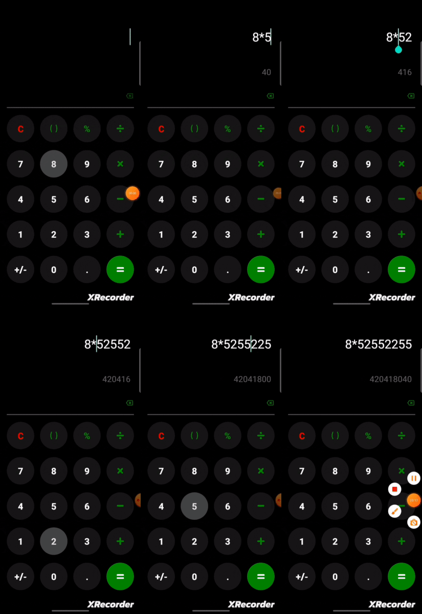
At this point, the calculator application's main functionality works, but then there is a bug with selecting a portion of the Calculation Input to add a new number. To demonstrate the bug, see the video below:

For us to fix this bug, we'll need to know where the selection cursor is at every time on the Calculation Input (first TextInput); therefore, we need to listen to every change on the selection. Luckily, the React Native <TextInput /> component allows us to keep track of this with some props.
...

export default function App() {
    const [calValue, setCalValue] = useState("");
    const [previewValue, setPreviewValue] = useState("");
    const [isAnswer, setIsAnswer] = useState(false);
    const [cursorSel, setCursorSel] = useState({ end: 0, start: 0 });
    const [isCursorSel, setIsCursorSel] = useState(false);

    ...

    return (
        <View style={styles.container}>
          <TextInput
            style={[styles.input, ansColor]}
            value={calValue}
            onChangeText={setCalValue}
            selection={cursorSel}
            cursorColor='#8ad8d1'
            autoFocus={true}
            textAlign='right'
            onSelectionChange={(e) => {
              setIsCursorSel(true);
              setCursorSel(e.nativeEvent.selection);
            }}
            showSoftInputOnFocus={false}
          />
           <TextInput
             value={previewValue}...
           />

            ...
        </View>
    )
}
The above snippet shows only the changes; we'll need two new states. The first state const [cursorSel, setCursorSel] = useState({ end: 0, start: 0 }) keeps track of the selection cursor end and start property, while the second state const [isCursorSel, setIsCursorSel] = useState(false) track if the selection cursor has been changed.
On the Calculation Input, two new props were added, selection which take in the cursorSel state and onSelectionChange an event handler. The e.nativeEvent.selection expression gets the current location of the selection cursor, which is an object like this {start: 0, end: 0}.
onSelectionChange={(e) => {
   setIsCursorSel(true);
   setCursorSel(e.nativeEvent.selection);
}}
Even though we now keep track of when the selection cursor is moved with the onSelectionChange event handler, we haven't solved the bug. To solve the bug, every time a number is added to the Calculation Input, we need to know where the selection cursor is located and add the number to that spot. Therefore we'll need to change the functionality of the handlePress function.
const handlePress = (text) => {
    setIsAnswer(false);
    const corrText = text === "X" ? "*" : text === "+/-" ? "-" : text;

    setCursorSel({ end: cursorSel.end + 1, start: cursorSel.start + 1 });
    setCalValue((prev) => {
      if (prev.length !== cursorSel.end && isCursorSel) {
        let leftOver = prev.slice(0, cursorSel.end);
        let rightOver = prev.slice(cursorSel.end, prev.length);

        return `${leftOver}` + `${corrText}` + `${rightOver}`;
      }
      return prev + `${corrText}`;
    });
  };
Looking at the above snippet, it might look scary, but really what going on is that we first set the current selection cursor position with the setCursorSel function and then in the setCalValue function, there is a check if the previous value length prev is not equal to the cursorSel.end and isCursorSel is true.
Let's say the prev value is 5*4 and the cursorSel.end is at 0 , which means the selection cursor is next to 5 .
The leftOver variable would be "5*4".slice(0, 0) which returns an empty string ""
The rightOver variable would be "5*4".slice(0,3) which returns 5*4
Now, if the text parameter is "4", then corrText would be "4"
Put all together would be "" + "4" + "5*4" which evaluate to "45*4" .
This is a hacky solutions I know, but it works 😅
Okay, so that is it; we've successfully solved the bug; if you'll like to play around with it on your device, use the Expo snack below along with the Expo Go app; it's not suitable for the web.
GitHub repo: jomefavourite/calculator-native at blog branch (github.com)
Conclusion
If you've followed along with the article to this point, thank you very much, and if you can't tell, I'm still new to React Native 😊, and this is a project I built by myself without a guide just to get my hands dirty, and I can say React Native is really cool.
If you have suggestions on how the app could be improved, please leave a comment; also, I know there are other bugs. If you can fix them, do message on Twitter Favourite Jome (@FavouriteJome1).
Thanks for reading once again, and see you in the next Let's build Something Cool series 🤩


